A brand harking back to the era of pride as protest
As we turn fifteen, we decided it was time to re fashion ourselves and kickstart 2024 with a new brand for exeter pride.
Exeter Pride has been through a lot of change in the last few years. We have a new large committee for 2024 and we want to put Exeter Pride back on the map to show that we have returned and we aren’t going anywhere. Late last year we held several open meetings to get new people involved in the charity. At one of these meetings we were approached by two amazing individuals to suggest considering a re-brand. We had been wanting to look at the brand for a while now but didn’t have the creative expertise in the charity to do it, until now!
Sarah Drummond and Lou Downe who run School of Good Services developed a brand strategy for us that leaned heavily on LGBTQ+ protest ephemera of the past. We wanted to get back to our protest roots and ensure we carried on the work of our founders, campaigning for the rights of all members of our community in Exeter. We have come a long way as a society and as a city but there is still a lot of work to be done and we hope this new brand goes towards the reaffirming of our commitment to all members of our community. You are seen, you are heard, you are loved.
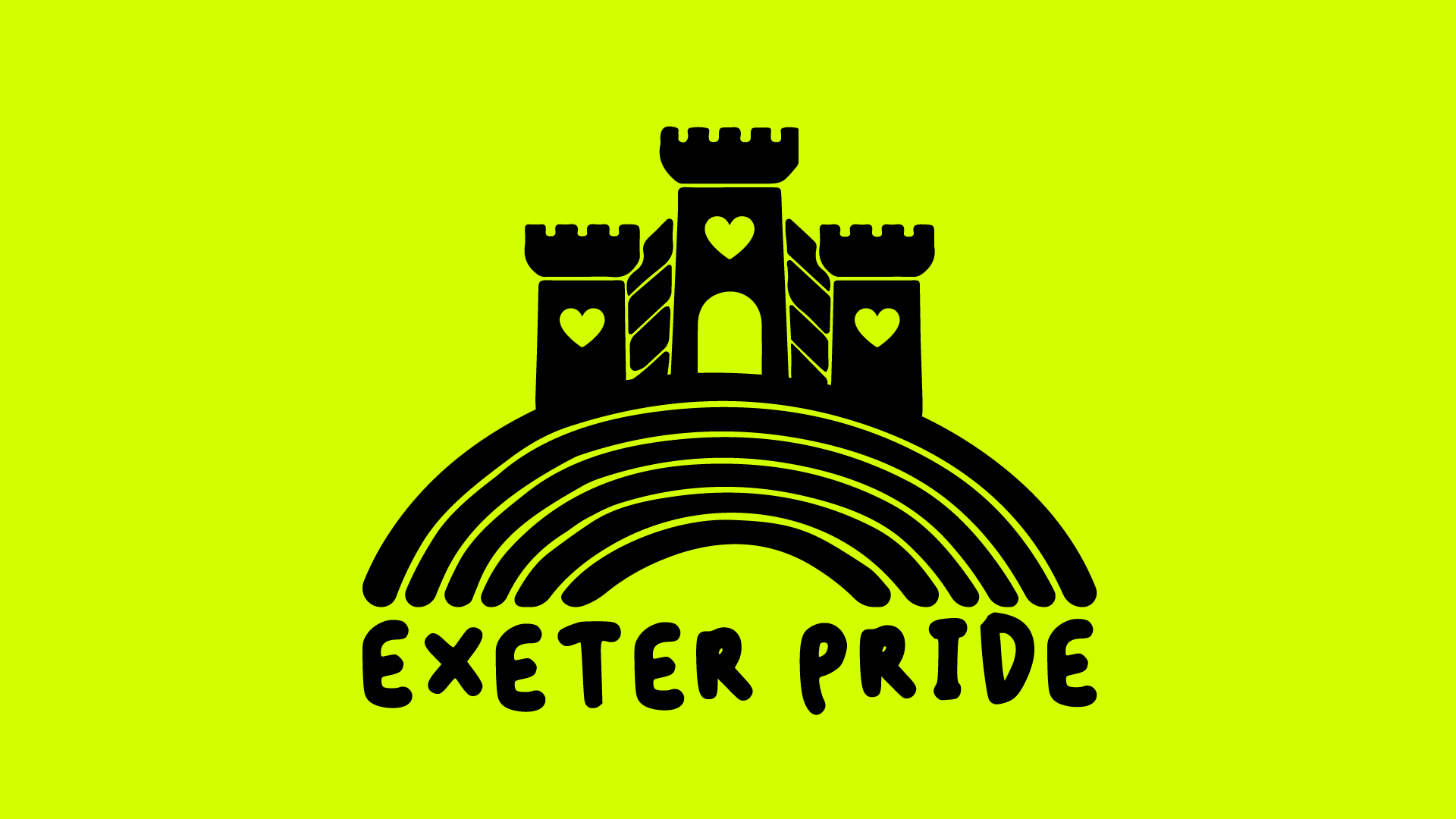
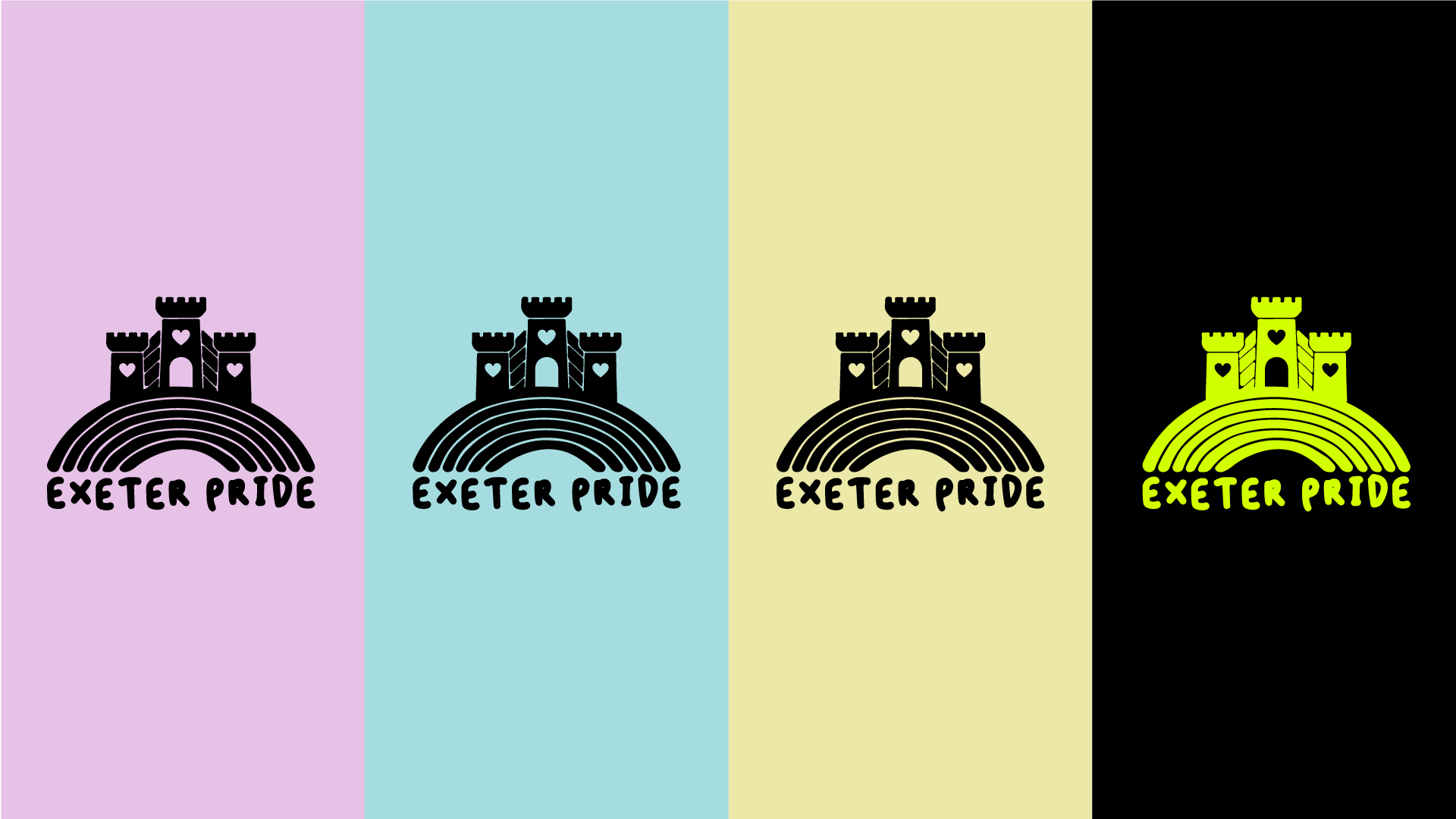
As a charity we said that we wanted the logo itself to be more distinctively of Exeter and not just another generic pride logo. Sarah and Lou came up with several suggestions, all great, but we all fell in love with this one!
Sarah is currently making a documentary on Section 28 interviewing activists and has spent time in archives poring over protest literature, leaflets and signs from the 1900s to modern day.
Here’s Sarah and Lou on the re-brand:
We were inspired by the Section 28 ephemera of the time when it came to protest banners, posters, leaflets, everything you see when you look back through the photography of the folks at Format or some of Gordon Rainsford documentation of the time.
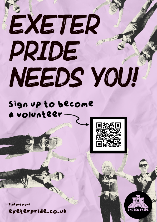
We really wanted to get a sense of movement in the brand, something less corporate and a bit more punk DIY aesthetic so it felt that more people could take hold of Exeter Pride and make it theirs.
“We really wanted to get a sense of movement in the brand, something less corporate and a bit more punk DIY aesthetic so it felt that more people could take hold of Exeter Pride and make it theirs”
We picked up references from work like Jamie Reid and the Sex Pistols and a nod to some of David Shrigley’s cheeky illustrations.
When conceiving the style and tone of the brand we considered the application of it in the future and wanted to ensure it could be used by a growing set of volunteers.
We purposefully picked a photocopier aesthetic and ragged edge to most of the images to make it easy for anyone to pick up the assets of the brand and assemble something, rather than feeling they had to work with something too constrained or something extremely polished that meant getting a layout ‘exactly right’.
Instead we’ve gone punk aesthetic. Purposefully messy.
We picked a colour palette that matches the cheapest stock of paper available so Exeter Pride can print in black and white, reduce ink usage through photocopying and go direct onto cheap paper stock. It’s a real hark back to the past of how the last generation of activists did it.
We think it looks cool, has a fresh DIY aesthetic and we’re happy to have helped thinking it through and providing the basis for the team to build from here. And just wait, the t-shirts we’ve got lined up, are pretty cool.
We’re hoping to help run some workshops in the lead up to Pride inviting people to come make banners and their own versions of the posters with their photographs and try out some photocopy-esque graphic design. Watch this space and sign up to the newsletter for announcements.
The brand is really in it’s first trial this week so please be kind to it and us and the wider team.
We’ve turned it around in our spare time outside of the day job over a few weeks, so we’ll improve, develop and build it over the next few months with more images, illustrations and assets.
It’s great to get it out there, test it and improve.


